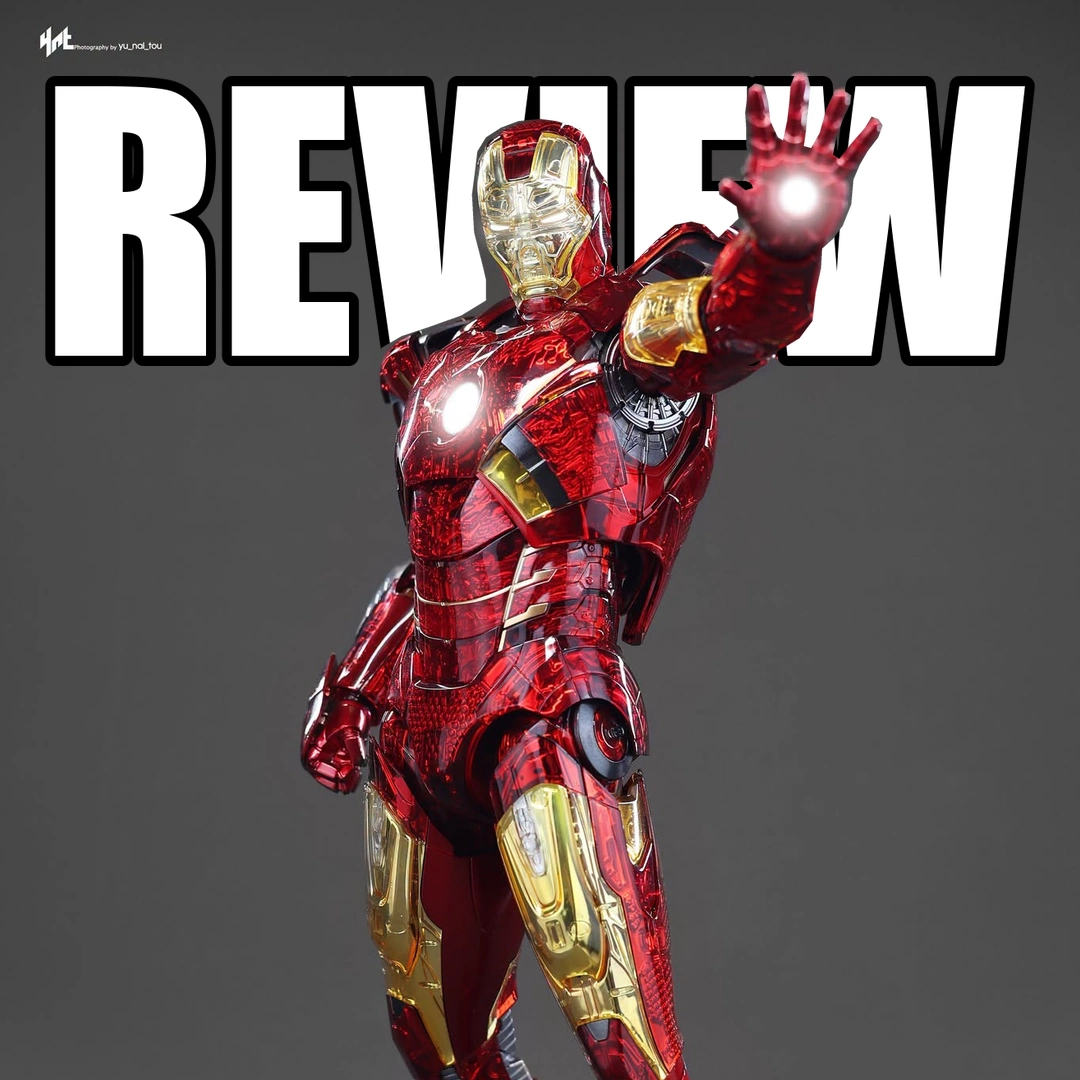
I don’t like what this finish does to the Mark 7. The clear red armor lets you see all the mechanical shapes underneath, but there’s so much going on that I lose the clean look of the suit. I want to look at Iron Man, not spend the whole time noticing screws, joins and little factory markings through the plastic.
I can see why the idea might appeal if you collect unusual Iron Man variants, and some of the yellow sections look better than the red. This Exo-Chrome Clear version still isn’t one I’d choose for my display case. Hot Toys needed to do more than make the armor see-through to make me want another Mark 7.
I Prefer the Mark 7 With Painted Armor
The clear panels have chrome underneath, so the light passes through the outer layer and reflects off what’s below it. That sounds like it could look really cool, but I don’t think the clear red gives the suit the finish it needs. It looks more like shiny plastic than painted armor to me.
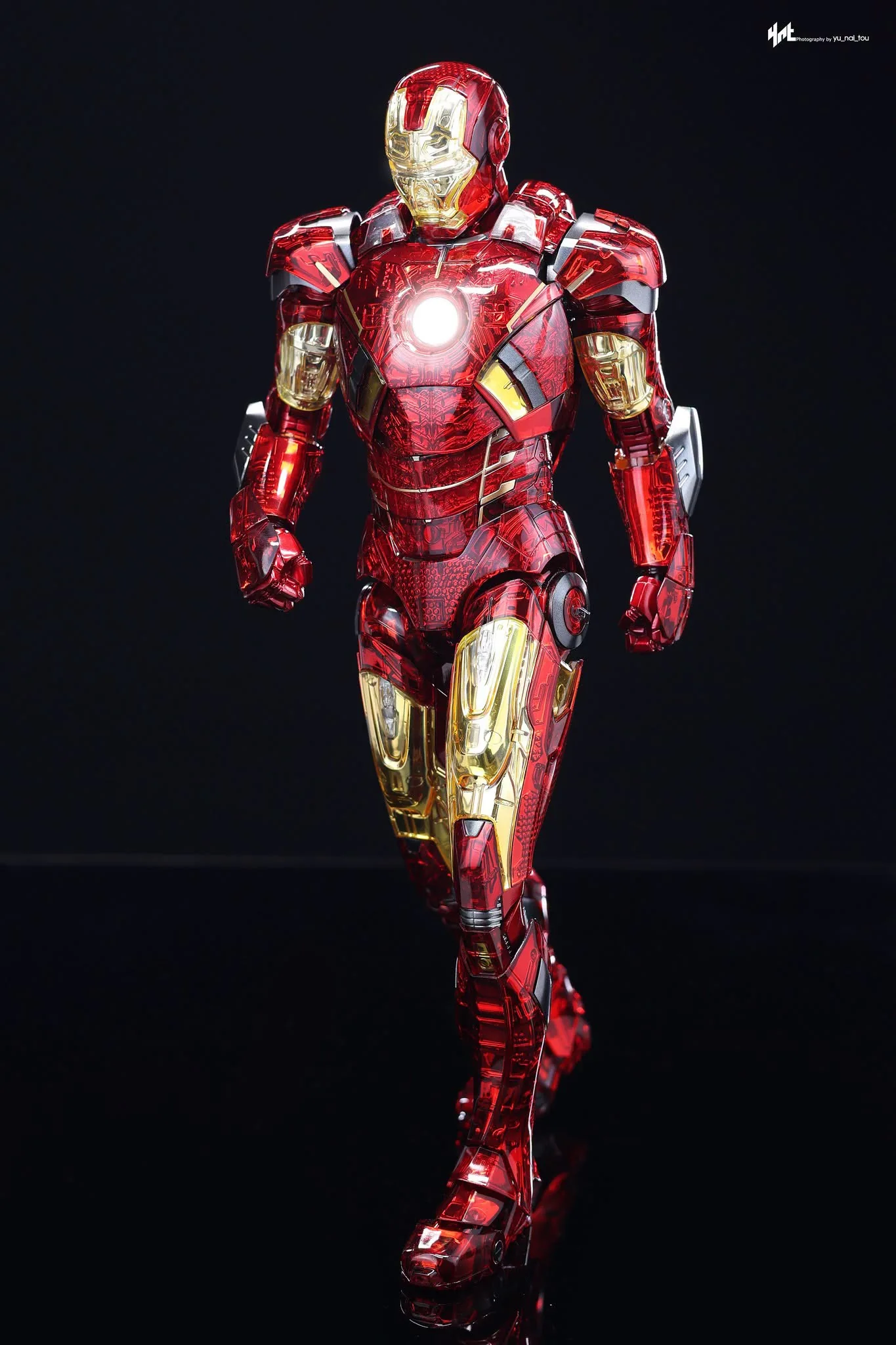
The yellow sections work better. The silver underneath gives them more shine, and I can appreciate the layered effect there. I wish the rest of the figure looked as convincing, because the red makes up so much of the suit.
This is still a diecast release, but that doesn’t mean all the parts you’re looking at are metal. The clear armor covers are plastic, while diecast is used in other parts of the figure and some of the joints. I wouldn’t mistake the weight of a figure for proof that every little panel and connection is sturdy.
There’s Too Much Showing Through the Clear Plastic
The helmet keeps the familiar Mark 7 shape, but the clear finish changes how the details look. I don’t mind seeing a few mechanical parts; I just don’t think everything underneath the outer armor needed to be visible. Some of it looks much more like the way a toy is assembled than the inside of an Iron Man suit.
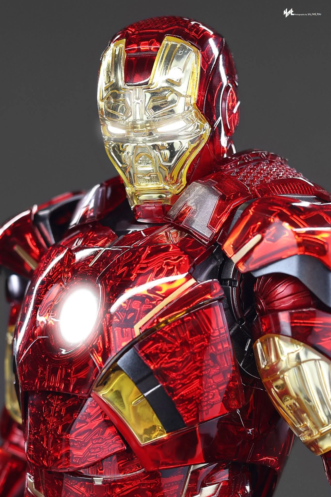
You can see little molded markings on some of the parts, including the hand sections. There are visible screw openings and joins elsewhere on the body as well. Those things are easy to ignore when they’re hidden under painted armor, but clear covers put them right in front of you.
The chest plate still comes off to show the detail beneath it. I usually enjoy that option on an Iron Man, but here I’m already seeing so much through the outer panels that removing another piece doesn’t do much for me. I’d rather have a really convincing outer suit first.
The Back Looks Better to Me Than the Front
I do like some of the grille detail around the back. The upper and lower flaps open, so there’s something to change when setting up a flying pose. The clear finish works a little better in these areas because I can make sense of the mechanical detail underneath.
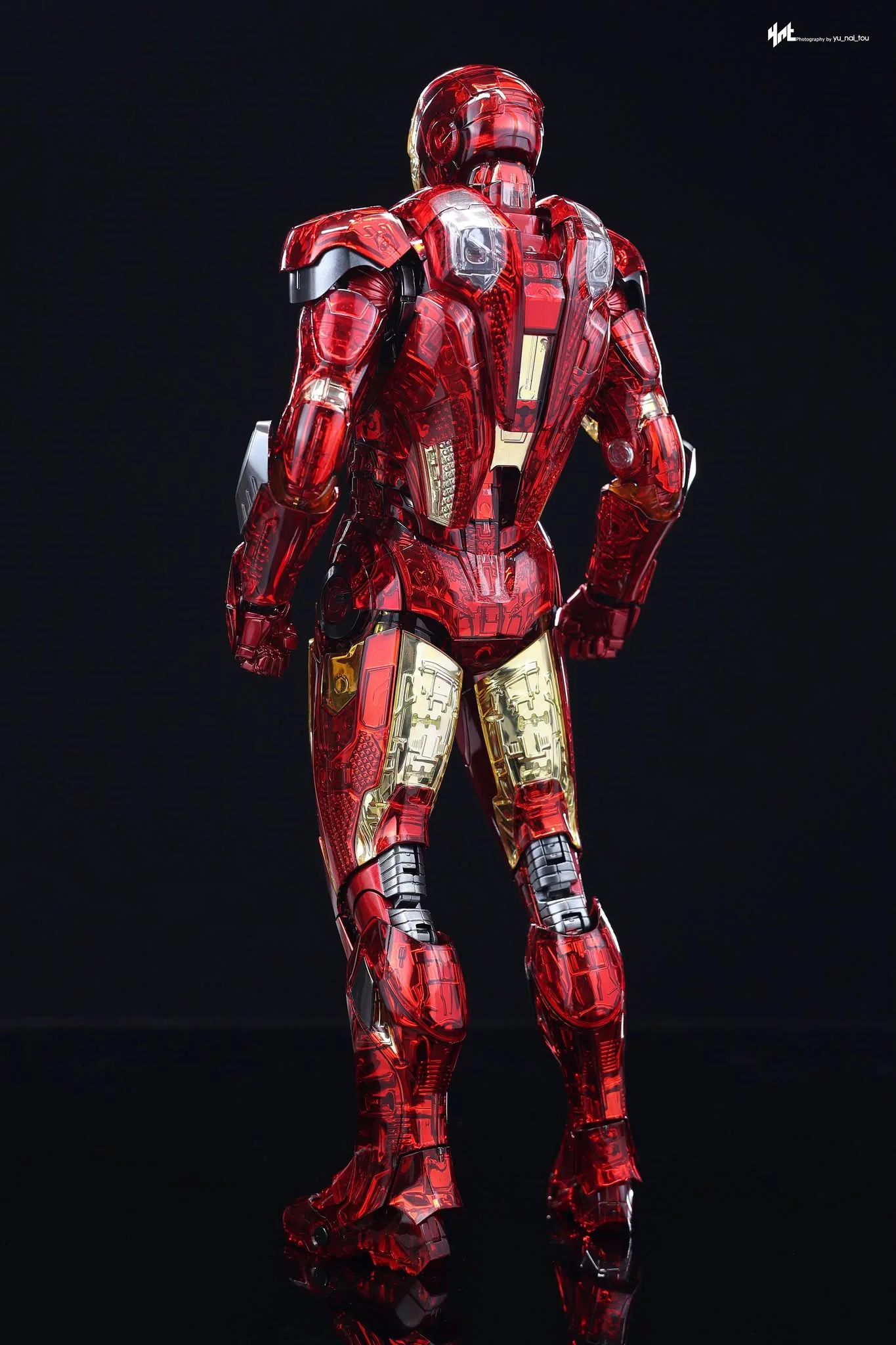
The darker gunmetal parts don’t stand out much against the rest of the figure, though. I like the painted gold around the abdomen more than the clear red, and I wish Hot Toys had used it in more places. As it is, the different finishes don’t come together in a way I enjoy looking at.
There are also a lot of little covers and attached pieces to work around. I’d be careful opening the flaps and moving the armor, especially where a small plastic tab is doing the work. If a panel doesn’t want to move, forcing it isn’t going to improve the figure.
The Accessories Don’t Make Up for the Armor
You get articulated hands, repulsor hands and the angled hands for the laser effects. I like having articulated fingers on an Iron Man because I can choose a more relaxed gesture, but the different hand finishes don’t all look consistent with the rest of this suit.
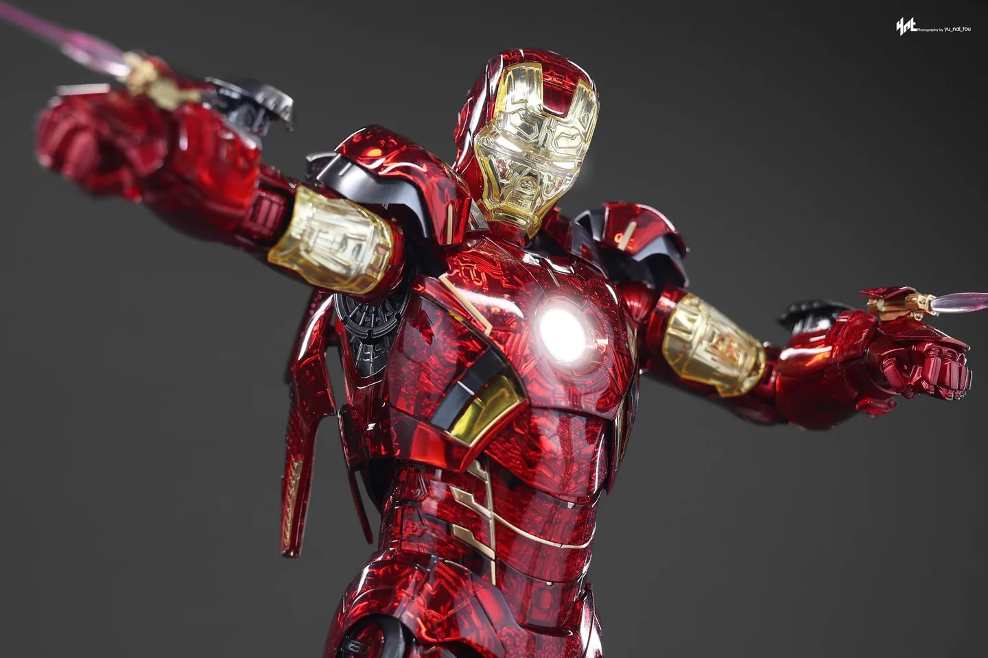
The articulated pair shows more of the detail beneath the clear sections, while the other hands have that metallic red finish. I’d have preferred a more consistent look across them. Changing the hands shouldn’t leave me feeling like one pair belongs to a different version of the figure.
The laser effects slide onto the dedicated hands using square pegs. They’re long and thin toward the ends, so I’d take my time fitting them and leave plenty of room around the figure. They give him a more dramatic pose, but I don’t think adding bright effects fixes what I dislike about the armor.
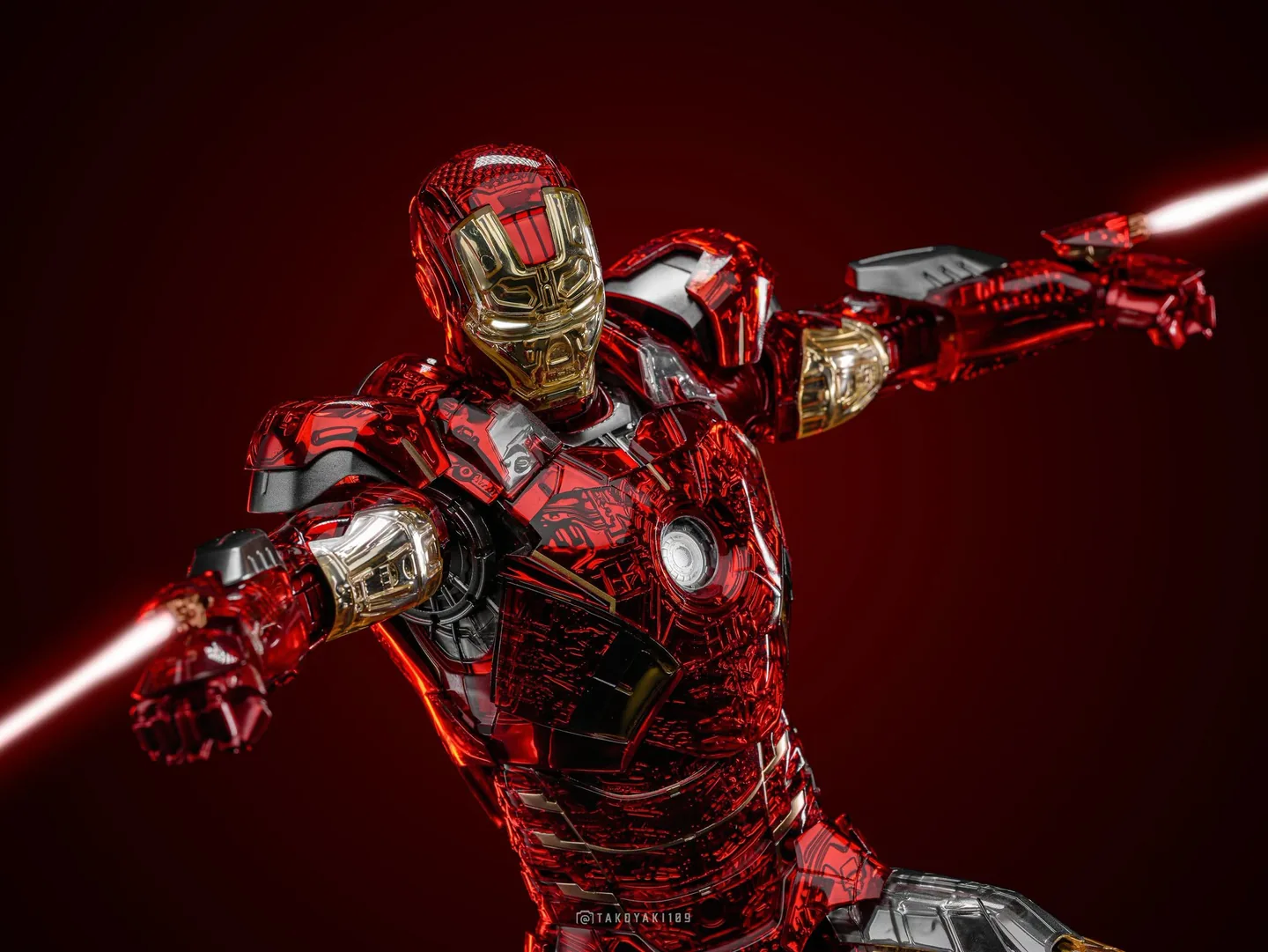
There are shoulder missile pods, replacement shoulder covers, forearm rocket parts and alternate thigh plates. The thigh plates let you show the emptied sections, but the full thigh missile-pod options from the regular Mark 7 aren’t included. I don’t understand giving this version fewer choices than the suit it’s based on.
Some of the shoulder pieces also have loose-looking connections rather than the secure fit I want from a part that hangs off the armor. I’d check that each one is properly attached before putting the figure in the case. A little accessory isn’t much fun if I’m worrying about it dropping off whenever I move the display.
I Would Have Liked a Better Base
The hexagonal base has an arc-reactor design and gold-and-black circuitry artwork. There’s a nameplate and a height-adjustable support, but no light-up base to make the display more interesting. For a version that is all about an unusual finish, I’d have liked something more than the standard base with different artwork.
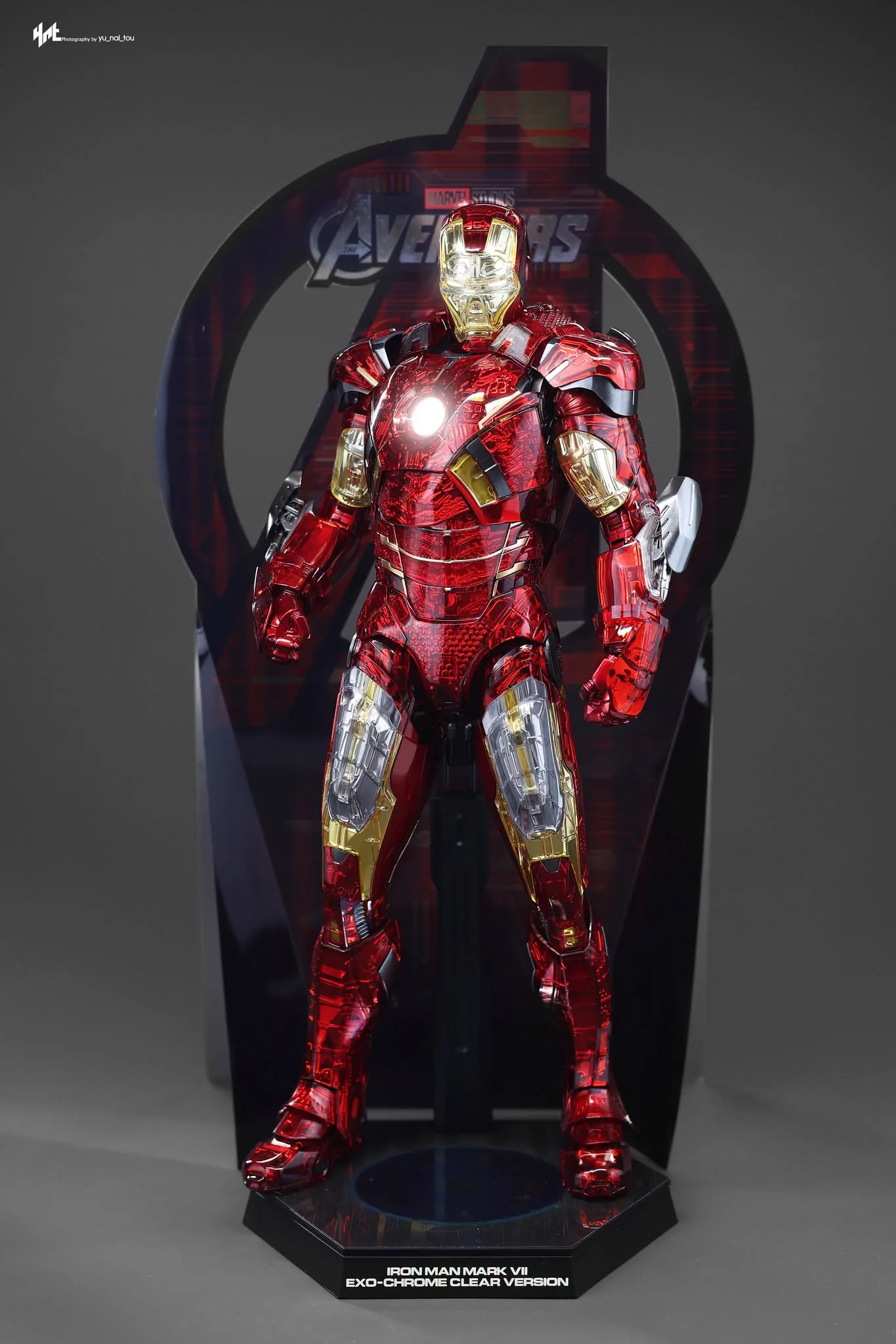
The tall cardboard backdrop has more of that circuitry pattern and the Avengers logo. It stands using the fold-out pieces at the back, but it takes up a lot of vertical room. I’d measure the space above the figure before assuming it will fit on your display shelf.
The helmet, chest and repulsor lighting still rely on button-cell batteries in separate compartments. I’d much rather have a single USB power connection than keep opening small armor panels just to use the lights. The clear body also makes stray light around a loose-fitting panel more noticeable.
If you’re comparing this with other suits, I have more of them covered in Hot Toys Reviews. There’s also an Iron Man Mark XLIII 2.0 preorder guide for a different, more conventional armor display; that’s a separate release, not another version of this clear Mark 7.
I’d Keep the Pose Simple
The shoulder pads move, the arms extend away from the body and the elbows bend past 90 degrees. There are extending hip joints and plenty of knee movement as well. The problem for me is that I’m thinking about all the armor pieces while posing him instead of enjoying the articulation.
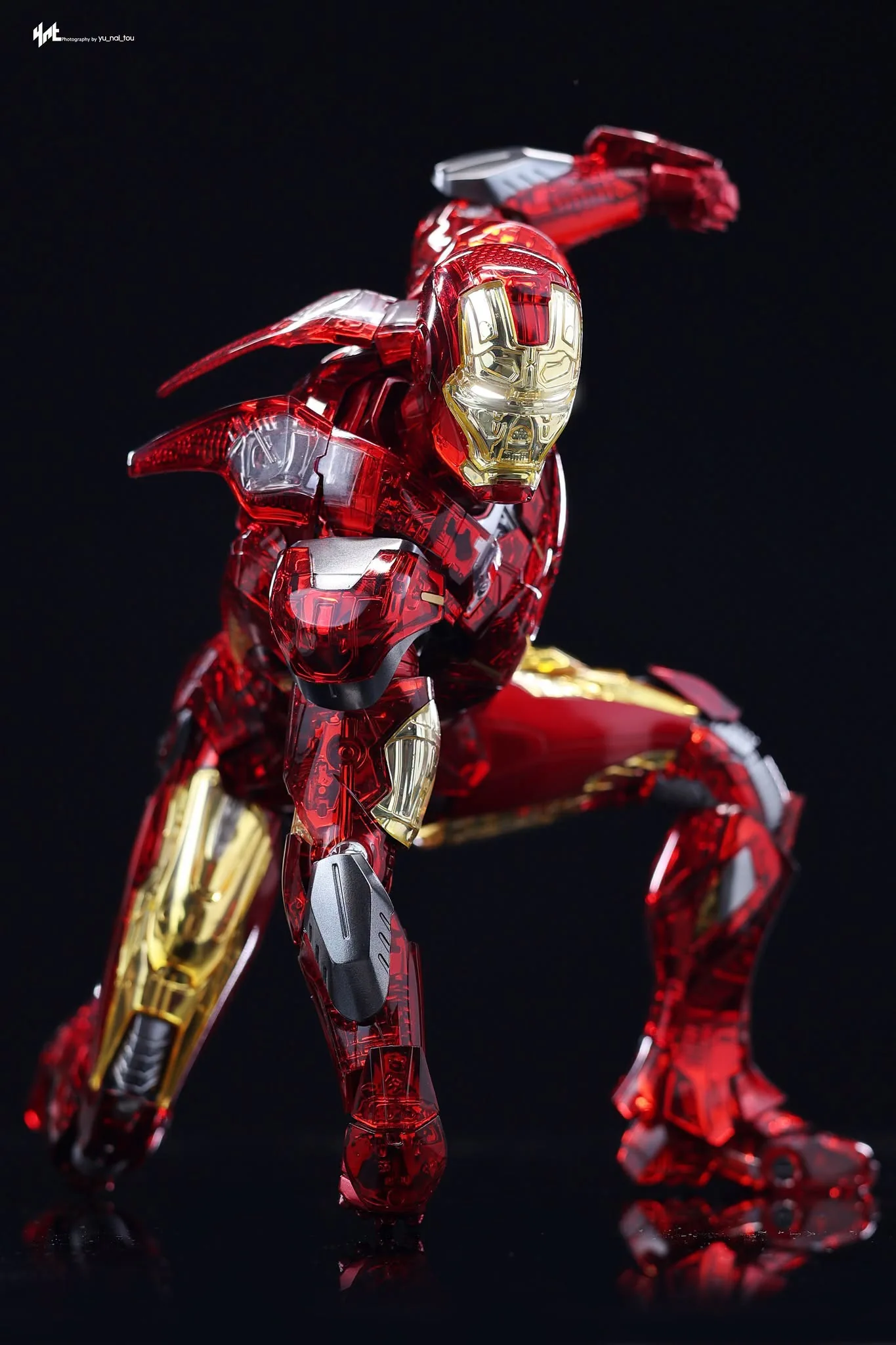
I’d start with a simple standing repulsor pose rather than keep changing the armor and switching accessories. I’d check the shoulder parts, clear tabs and any small covers before leaving him in the display case. I don’t want to put pressure on a little connection just to get a more extreme crouch.
The torso has a lot of weight above its joints, so I’d make sure the body and support are actually holding the position I want. I’d rather have fewer moving parts and a more secure build than keep worrying about the assembly.
This Isn’t a Mark 7 I’d Choose
The regular Mark 7 has a clear, recognizable look that I love, and this finish loses too much of that for me. The yellow sections and some of the back detail are the parts I like most, but they aren’t enough to make me happy with the whole figure.
I don’t like the busy clear red armor, visible assembly details, loose-fitting parts or the missing thigh missile options. If I were choosing a Mark 7 for my display case, I’d go with the regular suit instead, and I give this Exo-Chrome Clear version a 3 out of 10.
I’d choose the regular Mark 7. The clear red finish, exposed assembly details, loose parts and missing thigh missiles disappoint me.